Friday, 16 December 2011

Scarves from View magazine...


                                          Images from View Magazine, Spring 2009 Issue 85
             

I was having a look through an old copy of View magazine from Spring 2009, Issue 85 and came across some forecasts for scarves that season. I like the contrast of the delicate looking scarves being shot against an urban/city backdrop, (a theme I have not really explored which I could work on next term)  Even though they were from a couple of years ago they were still quite inspiring and pretty to look at.  Though also it’s funny just how often fashion goes around and comes around and certain styles and themes are recycled through the seasons.  I noticed how similar the abstract colours and the colourful florals looked similar to designers I have looked at such as Echo designs and Me and Kashmiere.

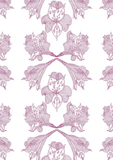
It has made me think about my Final Major Project for next term and possibly carrying on with designing scarves but with a different theme and ideas.  Also ideas on how I could improve from the final scarf I produced and generate further patterns and designs. I think it would be a good idea to pursue another scarf brief in order to better my printing skills and take more risks with pattern designing.  Another idea to take on board is the size and to probably go bigger with the fabric. Most importantly I think I should also produce a few designs on Photoshop or Illustrator as I did not do this with my Negotiated Brief. This would be very helpful in thinking about how to place certain images or colours or sizes before producing final designs. I’d like to be able to create symmetrical patterns on the computer as I think a mirrored effect would be quite stunning.  My computer skills also need a bit of improvement too so this would help me produce better computer designs!

Tuesday, 13 December 2011

Final Scarf Design


Finally completed final scarf design! After many decisions on what colours, print technique, type of fabric and dimensions to consider! My final design measures a square metre, (which I decided on from measuring some of my own scarves) is a discharge print, using dark pink and warm red and brown colours. I decided on creating a scarf which would also be warm and durable enough to wear in cold weather as well as just for aesthetic purposes, this is why in the end I decided not to continue to design a silk scarf as the fabric is quite delicate and fine. However I think it loses its exclusivity from using discharge print as opposed to silk screen printing.
I decided on a trailing and overlapping layout, as I like the way the roses appear to move and cross over creating more interlocking lines and shapes; this I feel works very well and is a good feature of the design.  When the scarf is worn and drapes around the neck, it also has a positive and trailing effect too.
Unfortunately when I was printing I used a bit too much paste which has left lines, although I like to think it could work as it is repeated throughout the design so could be part of the design?  Another problem with the print is the colours. Though I selected pink, red and brown they were a little too muddy and darker than I would have liked. When I was researching Liberty and Echo Designs they used sharp and bright colours which had a contemporary style, though I don’t think I mixed the dyes very well to create these bright, pop colours! 

Though after all of the testing and trialling of printing and designing patterns I’m pleased with the outcome. 

Monday, 12 December 2011

Portfolio Feedback - Shelia Heritage

Watercolour from sketchbook


Silk screen print


Design development board, heat press and silk prints


Mood board


For my second portfolio feedback visit I spoke to Shelia Heritage, a freelance wallpaper designer. Shelia keeps her work traditional, designing all of her wallpapers by hand using pencils and paints. I thought it would be very useful to get feedback from Shelia as I would really like to go freelance with my work.
We spoke firstly about my fabric prints, ranging from screen prints, discharge, silk screen printing and heat press; which she thought due to the bright colours that my style would be very much suited prints in fashion.  Also the subjects I used, florals, are always going to come in and out of fashion and interiors and that I had a good eye for selecting these.
Secondly we moved on to my presentation and how Shelia thought it looked. Shelia thought I had a good eye for composition and thought my mood boards and development boards were neatly presented; also that the way I had overlapped papers and drawings gave more depth and texture. However this could be improved by taking care of the papers and cards used to mount work, as some of them were a little creased and bent.
In terms of developing my work to a more professional standard Shelia recommended that I continue to keep up to date with current and future trends, as it is always important to be a bit ahead of what is going on in the design world.  Also to look more at the placement of a design and how it would fit in with the garment or interior, some of my designs are randomly scattered as opposed to sticking to an appropriate placement like half drop repeat or a border design.  Shelia mentioned that if I wanted to go freelance it is tricky and to bear in mind the client you are designing for, to keep designing and not to stick to the same style too much.

Wednesday, 7 December 2011

Trip to Hoopers...


I took a trip to Hoopers in Wilmslow, a lovely department store which sell luxury designer clothing/interiors and also some of the things from the High street. I felt I needed to have another look for myself at some scarves from the high end of the market and high street, to look at the types of fabrics used and pattern designs. Also I wanted to look at costs and how this might affect the type of fabrics I use for my final design and printing method, which would indicate whether it is a one off high end piece, or mass produced for a high street shop.
A brand of scarf I came across Echo, had some wonderful colourful, floral designs which I found really pretty. Their scarves ranged from rich silks to satins and cottons and were priced at about twenty pounds to fifty pounds. There was also a collection called Vintage which involved a range of patterns in repeat, ranging from a Herringbone design to a simple stripe design.
Me and Kashmiere, were a more expensive and luxurious brand of scarves; ranging from about ninety to one hundred and twenty pounds. Their designs really reflected the richness and high quality of the scarf, very subtle patterns and deep, rich colours.  I liked the deep and warm colours reds, browns,  oranges which I felt reflected the winter season.
After having a look at these two new designers I felt I had a clearer understanding of the type of scarf I might design, the colour palette and layout of the pattern.  Also how the selection of fabrics and design affect which market the scarf is designed for, i.e. high end market use high quality silks which are more pricey, high street  designers might choose more affordable synthetic fabrics.
                                                                       Echo Designs
   
                                                              Me and Kashmiere

Thursday, 17 November 2011

More experiments....


I’ve been continuing with my experiments in the print room of floral prints and colours. This time I added more texture and tonal variety by being braver and mixing different dyes together. I’m really pleased with how the heat press samples turned out as the colours look very strong, whereas in the last samples they looked a little weak and the designs too being very small. Also wanted to work on a larger scale of fabric with my silk screen printing just to be freer with my designing and enlarge features of the flowers. Working on bigger pieces of silk also helped me see how the silk would hang and drape and how the design looked from this. I wanted to use Liberty’s idea of shocking and sharp colours to have a more modern take on the florals as sometimes with floral designs they can look a little oldy worldy.  
I also found a very useful book in the Library today, with many photographs of Orchids and Lilies that I think I will start using in my designs; getting to the point where am painting the same one flower over and over again – not good!  I will use this book as a resource for doing a few more large scale paintings of flowers.  It would be nice to have long trailing Orchids flowing down the fabric so it appears as though they are moving.


The images above are photos of my most current silk screen prints and heat press prints which I have layered ontop of one another, want to organise them on a couple of boards so I can present my experiments and sampling to other people.

Thursday, 10 November 2011

Liberty silk scarves


I took a break from printing and had a look at some silk scarves by Liberty, to see how they are designed and the colours which are used to help me with deciding on my own silk scarf designs and come up with a colour palette.  
I choose to look at Liberty because they have some timeless and classic designs and are well known for luxury and high quality fabrics, also a very big fan of their prints!
Of the collection I looked at they carried a floral and botanical theme (similar to the themes in my work) and with this created a flowing and lucid feel.  They seemed quite traditional and twee in their design however there was a different take on some of the designs where the florals were replaced with exotic and bright colours. Almost a bit psychedelic and acidic in colour. I liked this contemporary and updated version of florals. I especially liked the scarves with a Leopard print design and instead of using the colours associated with a Leopards fur they used shocking bright shades of reds and blues and yellows.
I think my print experiments are a little simple at the moment with the limited selection of colours I’ve used. To possibly push the designs forward I think I will take note from Liberty’s scarves where there are much stronger and brighter colours, it also might be worth dying the fabric and choosing a fabric with colour so the background is not completely white and giving off a very blank and plain feel.

I need to take more risks with designing and fill the whole piece of fabric! Some of my designs look a little weak as they are just one image standing alone.

Wednesday, 9 November 2011

Hopes, fears and opportunities...


Over the three years of my degree I have really enjoyed being able to paint, watercolours, silk screen, acrylics, inks, emulsion. I probably over indulge in this hobby of mine!  Especially at the start of a new brief and producing primary research, observational paintings of flowers have been a major focus in my work throughout! It’s always great at the start of a brief anticipating how it will turn out and what paths you take with your work which is exciting too. I’ve also found composing mood boards an enjoyable but also challenging aspect in briefs, as it requires a lot of thought and reasoning why you place a certain image in a place. Also I love finding things, even on travels to quirky second hand shops or an old ring at the back of my drawer I forgot about. Composing a mood board is a selective process of gathering and constructing an inspiring board which ultimately tells a story of your themes.
However, there have been many obstacles to overcome like Illustrator, which at first was daunting though really I just needed to invest time into practicing with it. Though I fear sometimes I find it easy to give up and take a break when things don’t work so I need to focus and get on with it.  I can be quite slow with my work too, (especially if I’m in one of my painting moods!) I must work faster in order to get more work done required for briefs and importantly meet the deadline. Also I think I should be more experimental and make full use of the equipment around me in the studios, such as the vinyl cutter and sewing machines and try and incorporate those into my work.
I’ve considered freelancing however after my talks with Sheila and Nicky (both freelance designers) earlier this year, it would be tricky and a bit of a gamble starting from scratch and trying to make money. Though something I will consider in the future. Ideally I’d like to work in a design studio designing, whether it is interiors or fashion. However finding work experience has been tough which (still keeping my eyes peeled) I hope to find and have studio experience, working on briefs with other designers.
I’m still in two minds whether to go down the interiors route or fashion route with my work. (Partly because I’m very bad at making decisions) Both have their pros and cons for instance, I’ve found when working on briefs that fashion is very free and liberal when it comes to designing a print or pattern. With an interiors print it’s a little more restricted with how you place your pattern. Like wallpaper for example, is often printed in repeat or half drop or even as a border design.


I find it fairly easy to go from designing a bed spread to designing a print for a dress and love the different contexts of design. Now I just need to make a definite decision!

Tuesday, 8 November 2011

Printing samples and experiments...

Silk screen print

Heatpress transfer

Heatpress transfer

Two Layered silk screen pieces

Two layered silk screened pieces

I’ve been busy in the print room the past couple of days! After spending much time painting and collecting various bits and bobs for primary research I felt ready to get on with some printing. I have been experimenting with various designs, motifs and colours using heat press transfer print and silk screen printing. I choose these two methods as I like the see through and trailing appearance and often ghostly effect the print can give. I also put the mirror effect techniques to good use and continued my theme into colour.
The transfer print of the roses motif worked considerably well and I think the strong red outlines are very bold, I’d like to pursue this one as a repeat print. Perhaps a nice silk scarf? Though the top image of the blue flowers could work better if it were to be repeated multiple times, thus giving a fading and disappearing effect.

Unfortunately, I feel that some of my transfer prints ended up a little too ghostly and quite transparent! I think that I probably didn’t use enough dye and mix it enough, however these ghoulish pieces compliment very well when layered on top of each other (like I have done in the photograph of the silk prints) as you can see subtle lines and colours peering underneath. Maybe this could be an idea to use when mounting work and presenting? I think to push these designs a little further I could do with repeating a motif several times as the blank white background is a little plain. I think I could see these prints working well on silk scarves as well as print for a dress, so looking into how print can be applied like border, repeat, motif are things to consider when designing a final outcome too.

Tuesday, 18 October 2011

Portfolio feedback - Nicky Sharp

Image 1

Image 2

Image 3

Image 4

Image 5

 
Recently I spoke to Nicky Sharp, a freelance designer (who I also met a few months back) about improving my portfolio and what kind of styles and themes my work is suited to.
I found her comments and advice extremely useful especially from a designer who has worked in the industry as well as freelance work. Below is a snippet of Nicky's comments about three pieces of my work (which I have posted above)


Image 2 - It is a bit stiff but I like the watery quality of the petals. Perhaps create more images and create an allover. I have attached a jpeg (idea 4 for image 2). I like the splashy flowers at the top and bottom of the image and like the way flowers overlap and flow into each other. Put new images on to separate transparent layers in Photoshop and try over lapping them see if it works.
Image 3 - "I like this and it has a lot of potential. It would be nice as a vertical trail repeating. See jpeg (layout 1). The simplicity is nice but it could also be developed further by building up the trails with the addition of leaves and maybe some outline imagery. Put new selected images on separate transparent layers to see how you could work them together."
Image 4 - "Could be nice developed as in jpeg (layout 3 for outline design). Could add background and texture for extra dimension and depth."
Image 5 - "This is nice. I found an image that is similar that you could use for a layout, jpeg (layout 2). It could also be developed as a vertical trail."
Nicky also emailed me a few images (below) as inspiration and ideas to help me form certain styles, also to visualize how patterns/motifs can be applied in garments or interiors.


Idea 4

Layout 3

Idea 2

Layout 2
       

Wednesday, 5 October 2011

London Fashion Week - Mary Katrantzou


                                                     Mary Katrantzou, Spring/Summer 2012


I came across a new fashion designer whilst having a peek at shots of London Fashion Week, Mary Katrantzou. She Studied at Rhode Island School of Design and recieved a BA and MA at Central Saint Martins. Her all time design heroes are Coco Chanel, Balenciaga and Miuccia Prada, which these influences can be seen in her rich and elegant garments.
What I love about her clothes, (especially from the spring/summer 2012 collection!) are the shots of bright colours and combinations of different patterns in her garments. Whilst these designs look very scattered and busy there is an elegance and beauty to the eclectic colour combinations and varied shapes and patterns, lots of sheer and delicate detailing. She is very daring and experimental not just with her kooky patterns but where she applies them to, jackets, mini dresses, maxi dresses, trousers, mini skirts; which may seem a little extreme. However these wild patterns speak for themselves and are what make the garment(s).
There are many floral and nature themes within some of her designs and very feminine prints, though it seems like such a different and abstract like take on the floral trend with the mish mash of contemporary colours and opposing patterns.
Her kooky, unique style of colours and patterns has helped me to be more daring with colours and combining different images or motifs, in my designing for my fashion print.
Also what is so beautiful about Mary Katrantzou’s garments, are the luxurious and flowing, sheer fabrics which give her edgy and colourful designs a gorgeous, flowing and exuberant feel. I just find myself staring at them for ages! I think I’d really like to start experimenting with some silk screen printing and transfer printing after seeing such free and amazing, colourful designs!http://www.londonfashionweek.com/marykatrantzou

Tuesday, 27 September 2011

Gallery Visits, Tate and the Walker Art Gallery


                                             Diana Dias-Leão', glass dresses


I took a trip to the Walker Art Gallery and Tate Liverpool over the weekend, (which was nice to have a break from my own work and look at some great artists and designers!) where I found a mixture of unique art works from different aspects of art and design. Which ranged from sculpture, paint, textile and print.
I enjoyed looking at the ceramics at the Walker Art Gallery and seeing how pattern design is applied in that context, though I was really attracted to a collection of glass dresses.
These glass dresses are by artist called Diana Dias-Leão' and deal with the issues of body image. I found these glass dresses very pretty and unique pieces, though I like the concept of using a sharp yet breakable material; which is a good metaphor for describing someone with low self esteem.
At the Tate Gallery was an exhibition called Smoke Signals, by Robert Therrien which had an overwhelmingly large set of table and chairs! Another piece invlolved a towering stack of enormous plates, which had a dizzying effect after walking around them! I liked the parody of such boring and simple everyday objects we use, becoming larger than life and in which defeated their main function and purpose.
The exhibition upstairs of great contemporaries and modern artists, including the likes of the infamous Marcel Duchamp Urinal, Mondrian, Warhol and Bacon.  One of my favourites is The Lobster Telephone Dali, 1936 just because it’s so iconic for its strangeness and witty Chindogu idea, the lobster replacing the telephone speaker which like Therrien could be seen as a Chindogu idea as it lacks its real function and use. I felt thoroughly inspired by the abstract themes and colours in this room and thought how making these abstract textures, prints and patterns could be applied in my own works and onto fabric.

Friday, 23 September 2011

Opposites Attract...


                                Butterfly Wallpaper, Damien Hirst, 1994


                                          Colin Self, Nude, 1971


I took a trip to The Whitworth Art Gallery for some much needed inspiration, although I'm looking at fashion prints I was rather intrigued by some of the old floral wallpaper patterns on display. I really liked the elegance and minute detailing which I thought could just as easily work on fabric for a couture dress or repeated several times on a silk scarf.
There was an exhibition on called, Dark Matters. A collection of artist's works including Paula Rego and Colin Self (top) using tones and textures to reveal darkness and light. This I thought was relevant to my research into my glamour theme. Using black and white photographs and mediums for light and dark effects. It was interesting to look at a different perspective of art and design to gather ideas for a fashion print. The two images are of postcards I picked up in the shop, which I liked and felt fitted in with each of my themes. I have a penchant for colourful, pretty things (!) which is why I choose Damien Hirst’s Butterfly Wallpaper. The symmetrical and kaleidoscopic pattern looks so precise, perfect and immaculate and the various butterfly colours are beautiful. I’ve currently been experimenting with symmetry and colours for my colour theme of my brief. Painting one side of the paper and folding it over (much like the painting activities you would do at Primary School) to create a mirror image effect which is very fun too! From this I have developed a fair few patterns and sometimes I have shuffled the paper around to make the paint drip and create its own travels and tones. Though now, I want to apply this in my heat press printing as it could have a striking effect on sheer , translucent fabrics.

Tuesday, 20 September 2011

Negotiated Brief

Bright Colours

Old Glamour My Studio Space


I decided to take a different route with my design work and will be focusing on the fashion side of surface pattern design. I've been inspired by bright colours, jewels, paints, insects, florals, Madame Gres dresses, P. Horst and old glamour! My brief is to design a pattern to be printed onto fabric, suited for a runway dress. So far I have collated my drawings, photographs and scans from books/magazines to create two moodboards. One moodboard theme is Old Glamour where I have gone for black and white colours only, to reflect the idea of old fashion and P. Horst's photography. My second moodboard is Bright Colours, which is about fun fashion, bright paints, paint experiments and florals.


My next step is to experiment with silk screen printing and hopefully combine my two themes together to create patterns.

Tuesday, 10 May 2011

J. Dahlmanns Rug Star


I was looking at J. Dahlmanns Rug Star rugs which use beautiful, explosive blends of colours. Jurgen Dahlmanns describes these rugs as, "supercharged landscapes with life and colour which are similar to your behaviour." They are works of art with their strong, emotive uses of colour. No one rug is the same, some rugs use images of insects and florals whereas some are more contemporary and abstract with bright colours. This has encouraged me to be more experimental and open to using varied colour palettes for designing rugs in this brief.

Thursday, 31 March 2011

Development...


I had a look at The Designers Guild website and some Cath Kidston bedding to see the kind of floral designs that are happening. There were lots of lovely painterly and large floral motifs! Also a few half drop repeat designs too. This has encouraged me to produce some more colorful floral pieces and helped me look at the layout of the pattern design, as I kept producing designs that were a little out of place and not very accurate!

Friday, 18 March 2011

Possible Motifs...


Going through my old work and selecting pieces has been quite tricky! So decided to do some more observational work of florals so I have a wider range of images that I could choose from, also there were several pieces I would have liked to have used though they did not work well for bedding designs.


Above are a few paintings, drawings that I want to use for my bedding designs. I like the idea of repeating these multiple times and creating a detailed and ornate theme, which would answer the Le Marais themeboard.

Friday, 11 March 2011

Holly Lawton


Recently I spoke to Holly Lawton, a surface pattern designer who creates some colourful and beautiful designs. I asked Holly a few questions about what inspires her works and what interests her.


How would you best describe the style of your work?


A combination of detailed linear work and strong colour with a crisp finish.


What interests you and influences your work?


I find inspiration in an array of things and I am a great believer in the interest of the everyday. One of my strong influences has been urban architecture, which appeals to my love of linear detail and strong form. I then find myself being drawn towards the organic, flowing forms of flora. The thing is to be open minded, to keep your eyes peeled and respond to what excites you at the time, leads you to create original work and has enough mileage to produce a strong collection.


What is your favorite aspect of surface pattern designing?


The tranformative power of colour. I am constantly surprised and excited by the way colour combinations and ratios can completely change the look of a design. It's an extremely powerful tool and I always enjoy the process of applying colour to my designs.


Which artists/designers works do you admire?


Lucienne Day - such an important figure in the history of British textile design. Her designs are still relevant and contemporary to this day. I love the hand drawn and sketchy elements.Orla Kiely - because she has cleverly built an extremely strong brand around her style in an industry where it is hard to stand out. Her combination of crisp, graphic, 60's influenced designs are deceptively simple.Nigel Peake - I adore his linear aesthetic, which appeals to my love of hand drawing and the vast array of patterns that exist within one image.I could go on and on, but they're the people that sprung to mind.


What products do you like to see your floral and graphic pattern designs on?Anything from paper products to fashion to interior furnishings. I just like my work being out there to be enjoyed.


Who do you see are your target market?


Working through an agent, means that to a certain extent this is taken out of my hands and the buyers make that judgement for me. I receive a brief, mood board and colour palette and create a collection based around these elements and focus more on trends than target market. Personally I think my florals will appeal to women across quite a broad age range. My graphic/geometric designs I like to think will appeal to both men and women 18-30 age range.

Friday, 4 March 2011

Primark Brief


For the next two weeks I am to come up with a few concepts for bedding which would be produced for Primark. I have six theme boards to follow, two of which I really think my work could fit into. Le Marais, luxurious, detailed, elegant, soft, muted colours. The other one is Seraglio, bright clashing colours, fairly big floral motifs and patterns.


As it is such a short amount of time I will be selecting works from past projects, design sheets, sketch books to edit onto Photoshop/ Illustator, maybe some of them will be an improvement!